THE LOGBOOK
Stories Behind the Designs
Every design has a story.
Some were inspired by places. Some by people. Some by lessons learned the hard way. Others by memories that refuse to fade with time.
The designs found throughout Dead Reckoning Apparel aren't random graphics. They're pieces of a journey shaped by coastal life, military service, adventure, friendship, perseverance, and the experiences that help us find our bearing.
This is The Logbook.
ENTRY 000 - BEFORE DEAD RECKONING
Every bearing starts somewhere.
Every course has a starting point.
For me, it wasn't a business plan or a design studio.
It was a hospital.
After fifteen years of military service, deployments, injuries, setbacks, and years of battling depression, I found myself at a point where I needed help. One of my closest friends had spent years encouraging me to get it. Eventually, I listened.
While I was there, an art therapy instructor handed me a pencil and encouraged me to start creating. The funny thing is, I had never been an artist.
What started as a simple exercise became an outlet. A release. For the first time in a long time, my mind had somewhere productive to go.
The sketches and paintings in this entry aren't the foundation of a clothing brand.
They're the foundation of me finding my way back.
Looking back now, I can see the first traces of Dead Reckoning taking shape.
Every bearing starts somewhere.
These were mine.
ENTRY 001 - SHUCK IT
Sometimes the best course is simply letting go.
I grew up on the Gulf Coast of Texas where oysters were a way of life. Fresh, plentiful, and usually enjoyed straight from the shell.
Even after moving to the Atlantic coast, I never lost my love for the water, seafood, and the coastal lifestyle that shaped me.
Over time, however, "Shuck It" became more than oysters.
Military service, deployments, skin cancer, setbacks, and life's inevitable hard lessons all reinforced the same realization: some things simply aren't worth carrying forever.
This design is a reminder to let go of what weighs you down, keep your sense of humor, and keep moving forward.
Sometimes the answer isn't "forget it."
Sometimes it's simply:
Shuck It.
That's the spirit behind this design—a reminder that life is too short to carry every burden. Keep your course, keep your humor, and when necessary... shuck it.
ENTRY 002 - SURF CITY OG
Some places become part of who you are
When I moved to Surf City in 2013, the old swing bridge was already part of everyday life.
Everyone complained about it.
You'd sit in traffic waiting for it to open for passing boats. Locals cursed it. Tourists got frustrated. It could turn a short drive into a long wait without warning.
At the time, I couldn't wait for the new bridge to be built.
Then it was gone.
The new high-rise bridge was faster, easier, and everything people said they wanted. But somewhere along the way I realized the old swing bridge was more than a bridge.
It was character.
It was fishermen heading out before sunrise, surfers chasing swell, summer traffic, boat horns, and memories made while waiting for the gates to come back down.
The things that made it inconvenient were the same things that made it uniquely Surf City.
The Surf City OG design is my tribute to that piece of local history—a reminder that sometimes we don't realize what something means to us until it's gone.
ENTRY 003 - COCAINE SHARK
Some ideas are too ridiculous not to become reality
What started as a joke at work eventually became one of the most recognizable pieces of art I've ever created. Around 2025, it seemed like every week there was another news story about the military intercepting drug boats loaded with cocaine in the Caribbean and Eastern Pacific. The running joke around the unit was always the same:
"What happens to all the cocaine once it hits the water?"
The answer quickly became: "The sharks are eating it."
At first it was just another ridiculous conversation. Then someone mentioned Cocaine Bear, and before long we were imagining an entire population of sharks absolutely wired on cocaine, terrorizing the ocean and looking for their next fix. The idea refused to leave my head. So I drew it.
The boat's target marker served two purposes: a nod to military targeting and a reminder to feed the sharks more cocaine. It was absurd, completely unserious, and that's exactly why everyone loved it.
Before long, stickers and patches started appearing around the unit. People would see one on my coffee cup and laugh. For a long time, Cocaine Shark took on a life of its own. The joke spread, the artwork spread, and the story became part of unit folklore. Most people knew the shark.
Very few knew where it came from.
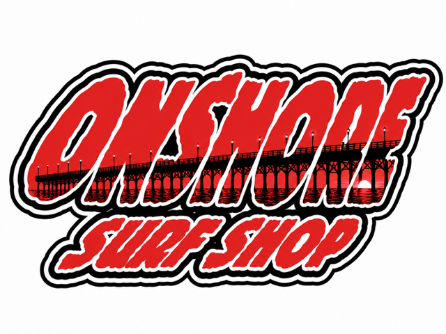
ENTRY 004 - TEAM ONSHORE
Some opportunities change more than you realize.
When I first started getting into art, one of the first people to support it was my longtime friend Josh from JB Surfboards.
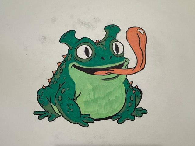
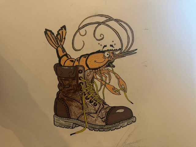
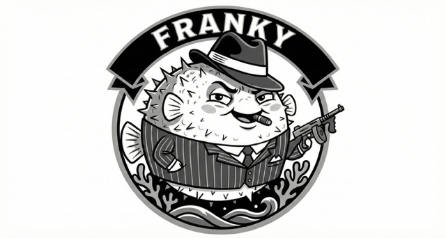
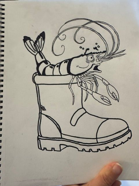
Josh started bringing me ideas and asking if I could help bring some of his surfboard concepts to life. What began as a creative outlet quickly turned into real projects. Before long, designs like Shrimp Boot, Sandspur, Horney Toad, and Frankie Da Fish were finding their way onto surfboards.
Josh and George at On Shore Surf Shop have been friends for decades. Josh rides for On Shore, his boards can be found in the shop, and the local surf community has always been tightly connected.
As my artwork started gaining traction, George gave me opportunities of his own. What started as a relationship through surfing grew into helping with logo concepts, contest artwork, and shop projects.
The Team Onshore graphic is my tribute to that chapter—not just to a surf shop, but to the people who believed in me before I believed in myself as an artist.
ENTRY 005 - CALL ME MISR
The best call signs usually have a story
The Call Me MISR design is a playful nod to the Maritime Intelligence, Surveillance, and Reconnaissance (MISR) community and the unique culture that comes with it.
Like many military communities, nicknames and call signs have a way of sticking. One of the inspirations behind this piece was a friend known simply as "Cuddles." Despite the name, he was exactly the kind of professional you'd want beside you when things mattered most.
That contrast is what made it memorable.
The design also pays tribute to the MISR Weapons and Tactics Instructor community—an elite group of professionals responsible for connecting intelligence, sensors, operations, and decision-makers to create advantages across the battlespace.
Most people outside the community will never know what MISR means. But for those who do, it represents a profession built on teamwork, expertise, and a healthy sense of humor.
Sometimes the best call signs are the ones you never would have chosen for yourself.
ENTRY 006 - MAMA KAT
Laissez les bons temps rouler - "Let the good times roll"
Growing up in southeast Texas, Louisiana was never far away. My grandparents, Pammy and Poppie, would take me across the state line to visit family in New Orleans and Lafayette. Those trips were filled with family, food, and whatever casino happened to be calling Poppie's name that day.
Like most Gulf Coast kids, I grew up during crawfish season. Crawfish boils, Cajun cooking, and finding a way to put crawfish tails into just about everything wasn't a special occasion—it was simply part of life. To this day, I'm still obsessed with Cajun cuisine.
Years later, while I was in the hospital, I met two fellow patients from Louisiana—an Air Force veteran everyone called "Bougie" and an Army Sergeant Major named Beau. Between therapy sessions, we spent plenty of time talking about home, food, Mardi Gras, and the culture we all loved.
Beau was one of the kindest people I met during that chapter of my life. He called me "Mama Kat," had a way of making people laugh when people needed it most, and embodied the same spirit I've always associated with Louisiana: resilience, hospitality, and never passing up a reason to enjoy life.
The Mama Kat design became my tribute to that culture. A little Mardi Gras, a little Gulf Coast, and a reminder that some of the best friendships are formed when you least expect them.
As Beau would say:
Laissez les bons temps rouler.
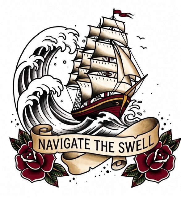
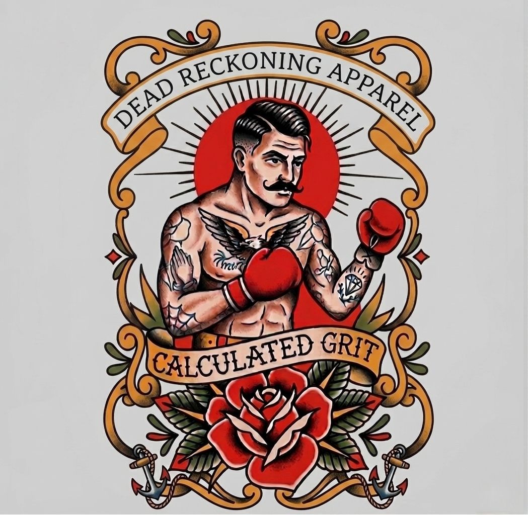
ENTRY 007 - FIND YOUR BEARING
Before you can chart a course, you have to know where you stand
Unlike many of the designs in this logbook, Find Your Bearing isn't tied to a single place, person, or moment. It represents a philosophy that has followed me through military service, deployments, travel, competition, recovery, and every challenge life has put in front of me.
As a map maker, I spent years helping others navigate unfamiliar terrain. Whether in the Middle East, Africa, the Pacific, or somewhere in between, the first step was always the same: Find your bearing.
The phrase eventually became bigger than navigation. It became a reminder that before you can move forward, you have to understand where you are, who you are, and what matters most.
That idea became the foundation of a collection of American Traditional designs inspired by the principles that have guided my life:
Find Your Bearing — Know where you stand.
Calculated Risk — Progress requires courage.
Calculated Grit — Persevere when the path gets difficult.
Navigate the Swell — Adapt to changing conditions.
Different phrases. Same compass.
Together they represent the mindset behind Dead Reckoning: navigating uncertainty, embracing challenges, and continuing forward even when the path isn't clearly marked.
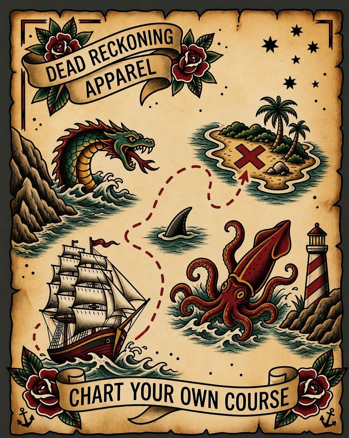
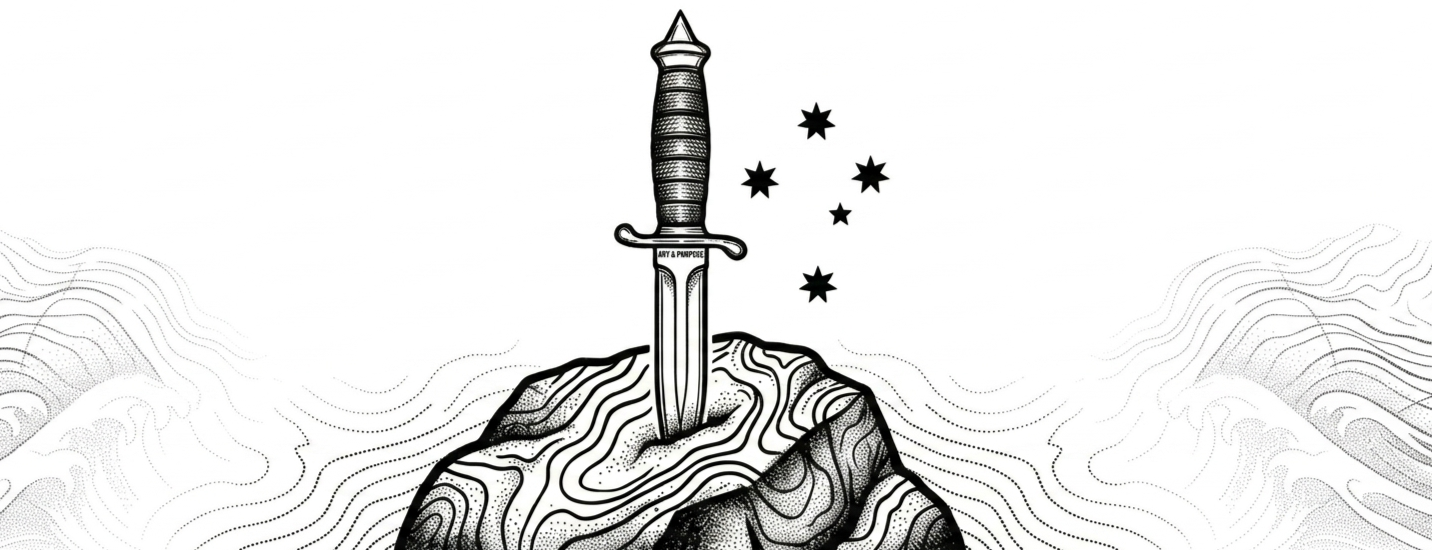
ENTRY 008 - CHART YOUR OWN COURSE
The map won't always exist. Sometimes you have to draw it yourself.
For most of my life, someone handed me a mission, a destination, or a set of coordinates.
Military service taught me how to navigate uncertainty. As a map maker, I spent years helping others understand terrain, identify routes, and find their way through places they had never seen before. Deployments took me across the Middle East, Africa, the Pacific, and beyond. Every environment was different, but the principle was always the same:
Know where you are.
Know where you're going.
Adapt when the plan changes.
But life doesn't always provide a map.
And sometimes the hardest terrain you'll ever navigate is your own life.
There are moments when the route disappears completely. Injuries, setbacks, failure, loss, illness, and the unexpected turns that force you to decide who you're going to be next.
Those moments taught me something navigation never could: Sometimes you have to chart your own course.
This design became the foundation of Dead Reckoning Apparel because every element represents a chapter of that journey.
The topographic lines represent my years as a map maker. The wave represents the ocean, competition, and the lessons surfing taught me about patience, resilience, and adapting to changing conditions. The Southern Cross is a quiet nod to time spent serving in elite communities and operating far from home under unfamiliar skies. The dagger represents courage—the willingness to move forward even when the outcome isn't guaranteed. And the route itself represents the path all of us take: imperfect, unpredictable, and rarely straight.
Dead Reckoning was never meant to be just a clothing brand. It's a reminder that no matter where life leaves you, you can still choose your next heading.
You may not control the conditions.
You may not control the obstacles.
But you can always choose your next heading.
You can always chart your own course.